Sound policies rely on sound data, but statistics can be very misleading. I strongly recommend that all policy makers should read David Spiegelhalter's The Art of Statistics: Learning from Data - a wonderfully accessible text for non-statisticians, Here are summaries of some of the problems that he discusses.
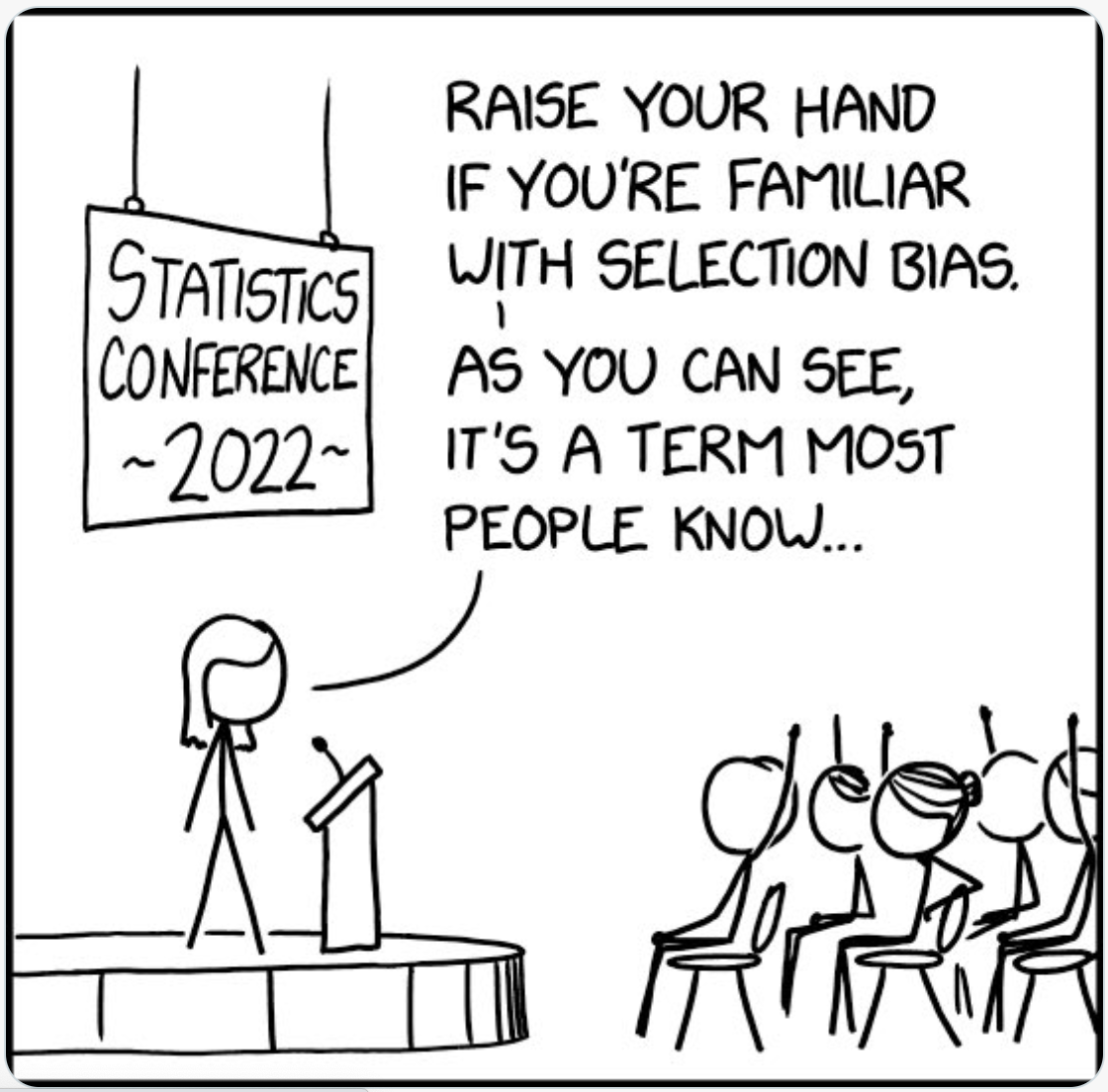
- Selection Bias:- The person or organisation providing the data may, deliberately or otherwise, have selected data which supports their interests or their point of view.
- Negative or unwelcome scientific research may not be published and researchers funded by sponsors may put a sponsor-friendly gloss on their results.
- Managers at all levels may offer data which makes their performance look good, whilst failing to draw attention to less flattering information. This is a particular problem in regulatory policy making where it is called information asymmetry.
-
There is a nice example of misleading gun control statistics in the note at the bottom of this web page.
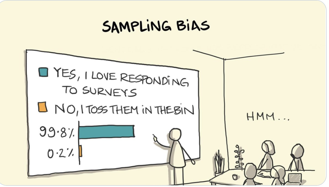
- Those who do not respond to surveys may have very different views to those who do. Imagine a 30 to 10 split "in favour" in responses to a questionnaire. Does this mean that "75% believe that ..." ? Not if the response rate was 40% and almost all the remaining 60% thought not. Matthew Syed reported one example as follows:
Scared Straight! was a documentary that attempted to steer young delinquents off the path of crime by taking them to adult prisons. The idea was that spending an hour with hardened jailbirds in a grimy room would scare them for ever away from a life of crime. And the statistics seemed great, as the 1978 Academy Award-winning film fronted by Peter Falk, of Columbo fame, testified. “80 to 90 per cent of the kids that they send to Rahway [State Prison] go straight after leaving this stage,” he said. “That is an amazing success story.”
But there was a problem. These statistics were based upon sending a questionnaire to parents about whether the behaviour of their children had improved. The “data” then measured the percentage of parents who said that it had improved compared with those who said that it had not. Can you see the flaw? Only the parents who replied to the questionnaire were included in the data. Those who didn’t respond — the majority — were entirely absent.
Consider how this would have distorted the result. It is possible that only the parents of children whose behaviour improved bothered to respond. Parents whose kids continued to behave badly may have thrown the questionnaire in the bin. This is called selection bias, a basic concept in statistical inference. When a controlled trial was conducted, it was revealed that Scared Straight!, far from deterring crime, made it far more likely. The “hidden data” was finally revealed. A programme that actively damaged young people was held in place for decades by flawed methodology.

- Aggregated statistics can look very different to the underlying figures.
- Vehicle accident statistics, for instance, generally include young and accident-prone drivers, as well as injuries to pedestrians and cyclists. Indeed, I understand that a middle-aged car driver in good weather may well be just as safe, over most long journeys in the UK, as if he or she were flying, which is a very safe form of transport.
- Similarly, apparently worrying death rates can look much less scary when you discover that they average the health outcomes of those who were previously very ill with those of the previously healthy. A report of deaths caused by, for example, air pollution might include a high proportion of those whose death was already imminent, rather than deaths from amongst an otherwise healthy population.
- Small sample sizes can produce very misleading results. Try to identify or organise meta research which aggregates the results of numerous smaller samples.
- Those responding to questionnaires may not tell the truth, inadvertently or deliberately
- Few of us can accurately recall what we have eaten, and may deliberately or otherwise under-report alcohol consumption, for instance - or cake consumption in my case.
- Many of us will give over-favourable ratings if asked about the performance of people we know well - such as university lecturers.
- Professor Ricard Tol tweeted that "I put more stock in student evaluations years after the fact. Every so often a former student tells me (s)he hated me at the time, but now realizes that I really taught them something ..."
- Students are unlikely to say that they have undertaken a useless university course, where they learned little, for they will need that course/university to have a good reputation when they come to apply for jobs.
- Teenage kids will often give absurd answers just to have a laugh.
- Different organisations will record data in different ways. The classic example is in France where, if an elderly person is found dead without evidence of health problems, it is acceptable to attribute the death to ‘old age’, thus reducing the apparent incidence of heart attacks. But crime statistics can be similarly unreliable, as are many others.
- Education and other regulators know that it is quite wrong to try to compare 'apples and pears". A 'First' from one university - or a First' in Engineering - may well be harder to achieve that a 'First' from another body, or in a different subject. And that is before you start allowing for grade drift as universities compete to attract students.
- Equally, students and patients may not be the best judge of the quality of their teachers or doctors respectively. Professors who perform in an entertaining way, and doctors with great bedside manners, may be far from the best in their profession. Remember Harold Shipman ...!
- The fact that there have been no incidents does not mean that something is safe. It is possible that the reason why fewer children are now killed on our roads is not because they are inherently safer than decades ago, but rather because they are so dangerous that many children are not allowed near them.
- Death, illness and injury rates can look very different when presented as a number (e.g. number of children killed in an incident) rather than as a proportion of the exposed population per annum.
- Survival rates can be very misleading. Screening for cancer, for instance, often appears to generate a high survival rate (over 5 years, say) compared with the survival rate of those whose cancers are detected when symptoms become obvious. But this can be because the time of diagnosis is earlier, so it appears that patients live longer even if treatment is ineffective. Or it can be because the tests also identify slow growing cancers.
- Isolated statistics can give a misleading impression. For instance, the radioactivity of a beach near a nuclear plant may be higher than many others, but is it also lower than other beaches which are nowhere near such a plant?
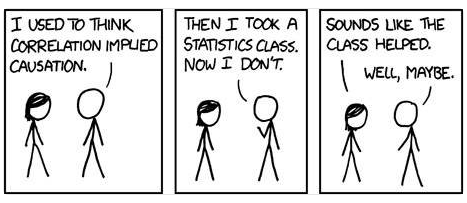
- Above all, correlation does not prove causation!


So what is to be done? If possible, you should design your own questionnaires and data-gathering exercises with the help of professional statisticians. To the extent that this is not possible, you must treat all data with a heavy dose of cynicism, bearing in mind all the issues listed above.
But do not be tempted, when faced with a hostile press or a one-sided lobby, to assemble your own dodgy statistics – or dodgy science – to fight them off. The inevitable result would be that those with whom you are trying to communicate would then see you as prejudiced and/or adversarial, and you might also then fail to pay insufficient attention to perfectly reasonable arguments from ‘the other side’. Instead, follow this link to read and apply some excellent advice about how to communicate statistics.
Nutrition Research
Several of the above problems bedevil scientific 'advice' about diet. New Scientist magazine's Clare Wilson published an interesting article on this area in July 2019. Here is an extract:
The big problem with these “observational” studies is that eating certain foods tends to go hand in hand with other behaviours that affect health. People who eat what is generally seen as an unhealthy diet – with more fast food, for instance – tend to have lower incomes and unhealthy lifestyles in other ways, such as smoking and taking less exercise. Conversely, eating supposed health foods correlates with higher incomes, with all the benefits they bring. These other behaviours are known as confounders, because in observational studies they can lead us astray. For example, even if blueberries don’t affect heart attack rates, those who eat more of them will have fewer heart attacks, simply because eating blueberries is a badge of middle-class prosperity. Researchers use statistical techniques to try to remove the distorting effects of confounders. But no one knows for certain which confounders to include, and picking different ones can change results.
To show just how conclusions can vary based on choice of confounders, Chirag Patel at Harvard Medical School examined the effects of taking a vitamin E supplement. He used a massive data set from a respected US study called the National Health and Nutrition Examination Survey. Depending on which mix of 13 possible confounders are used, taking this vitamin can apparently either reduce death rates, have no effect at all or even raise deaths. Patel says this shows researchers can get any result they want out of their data, by plugging into their analysis tools whatever confounders give an outcome that fits their favoured diet, be it low-fat or low-carbohydrate, vegetarian or Mediterranean.. ...
Another source of error is known as publication bias: studies that show interesting results are more likely to get published than those that don’t. So if two studies look at red meat and cancer, for instance, and only one shows a link, that one is more likely to be published. This bias happens at nearly every stage of the long process from the initial research to publication in a scientific journal and ultimately to news stories, if journalists like me write about it. “What you see published in the nightly news is the end result of a system where everyone is incentivised to come up with a positive result,”.
Further Reading
There are lots of good books about the use and abuse of statistics, written for non-experts. As well as almost everything by David Spiegelhalter, I can safely recommend almost everything by Tim Harford, including How to Make the World Add Up.